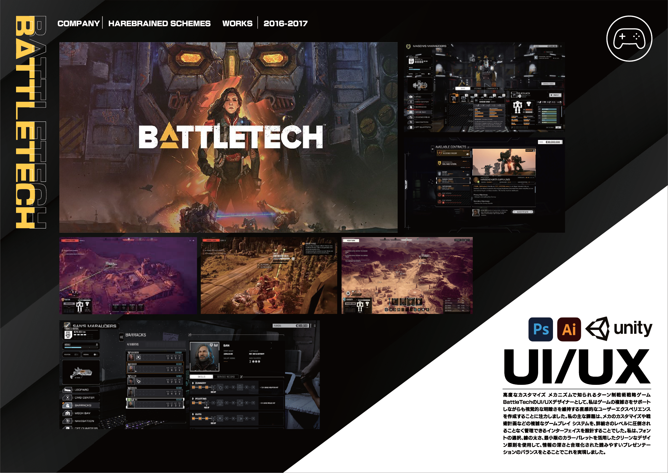
Professional Work
Here are some final designs and UX processes I made for various games & applications.
UI/UX Design
•
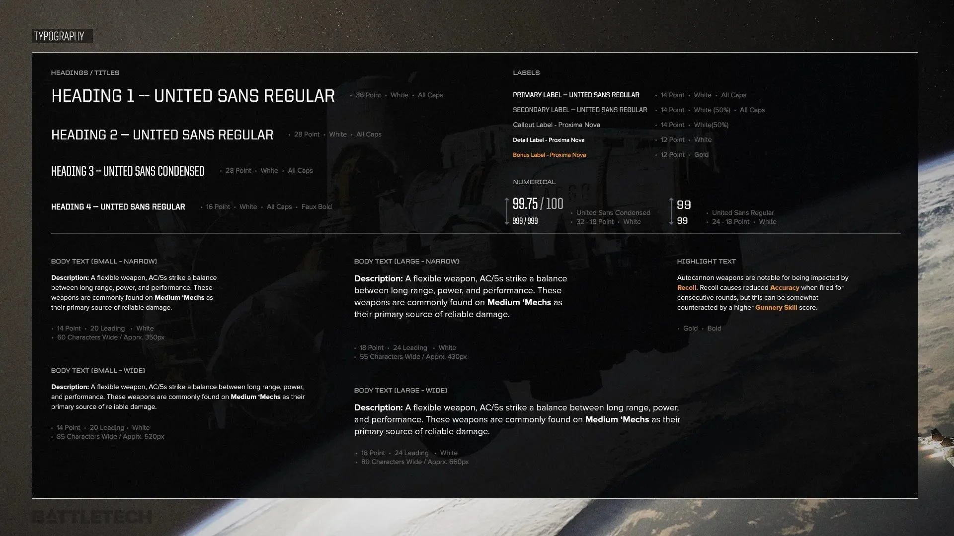
Typography
•
Video Game Design
•
Wireframes
•
UI/UX Design • Typography • Video Game Design • Wireframes •
MAIN OBJECTIVE
How might we simplify complex systems while maintaing the Battletech identity, empowering new and old players to play with confidence and clarity
Design Approach
To tackle these challenges, the game’s UI/UX is built on simple and practical design principles:
Creating Wireframes
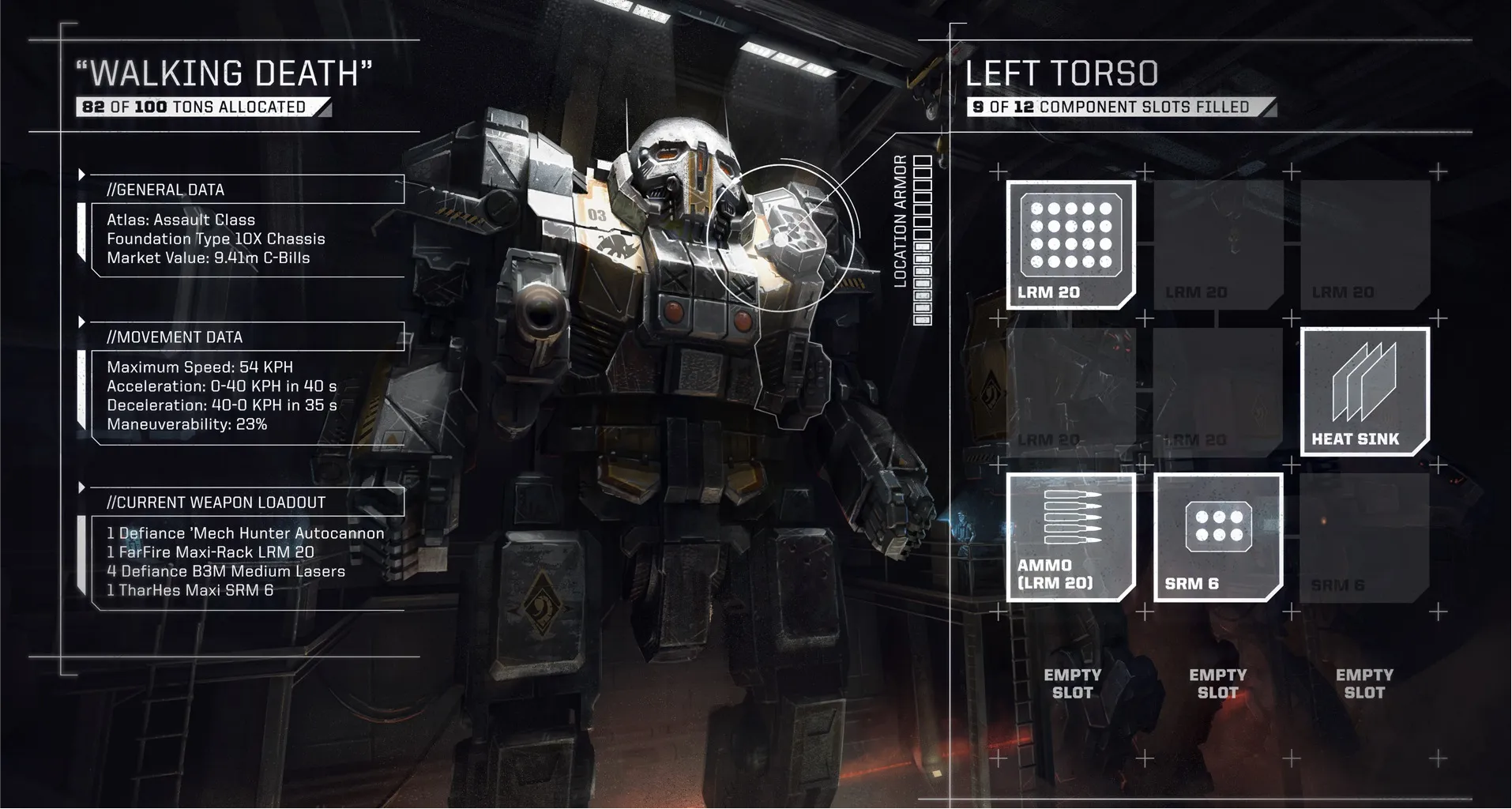
Battletech is a game of MASSIVE customization in a sci-fi, industrial, setting. I looked for a realistic mix of design principles and practical militaristic design.
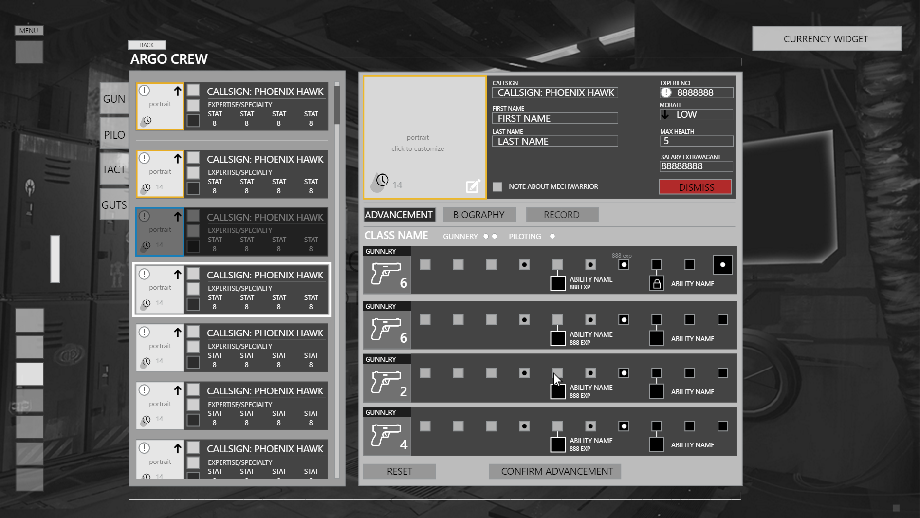
Crew customization screen
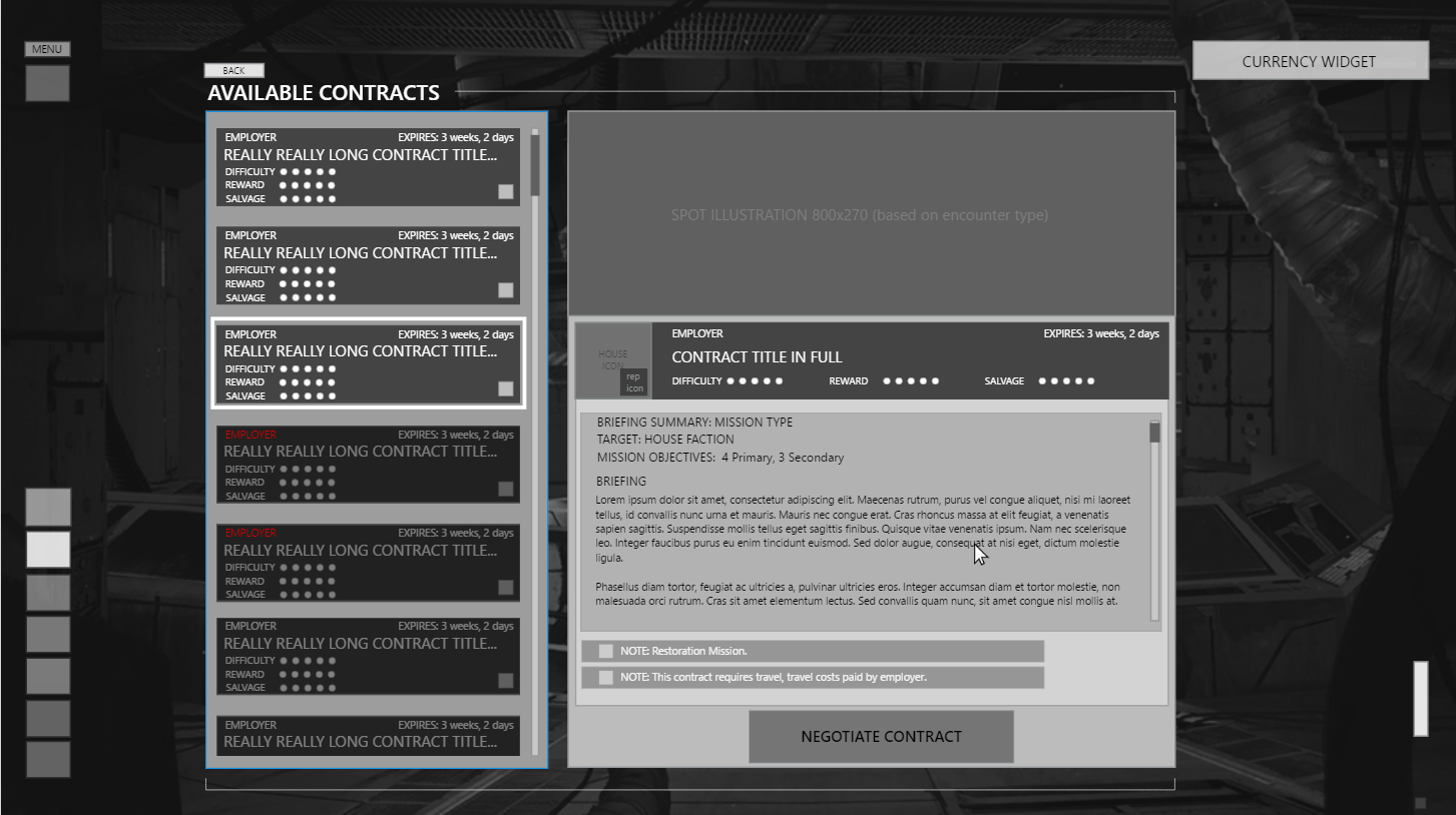
Contract screen

Event popup
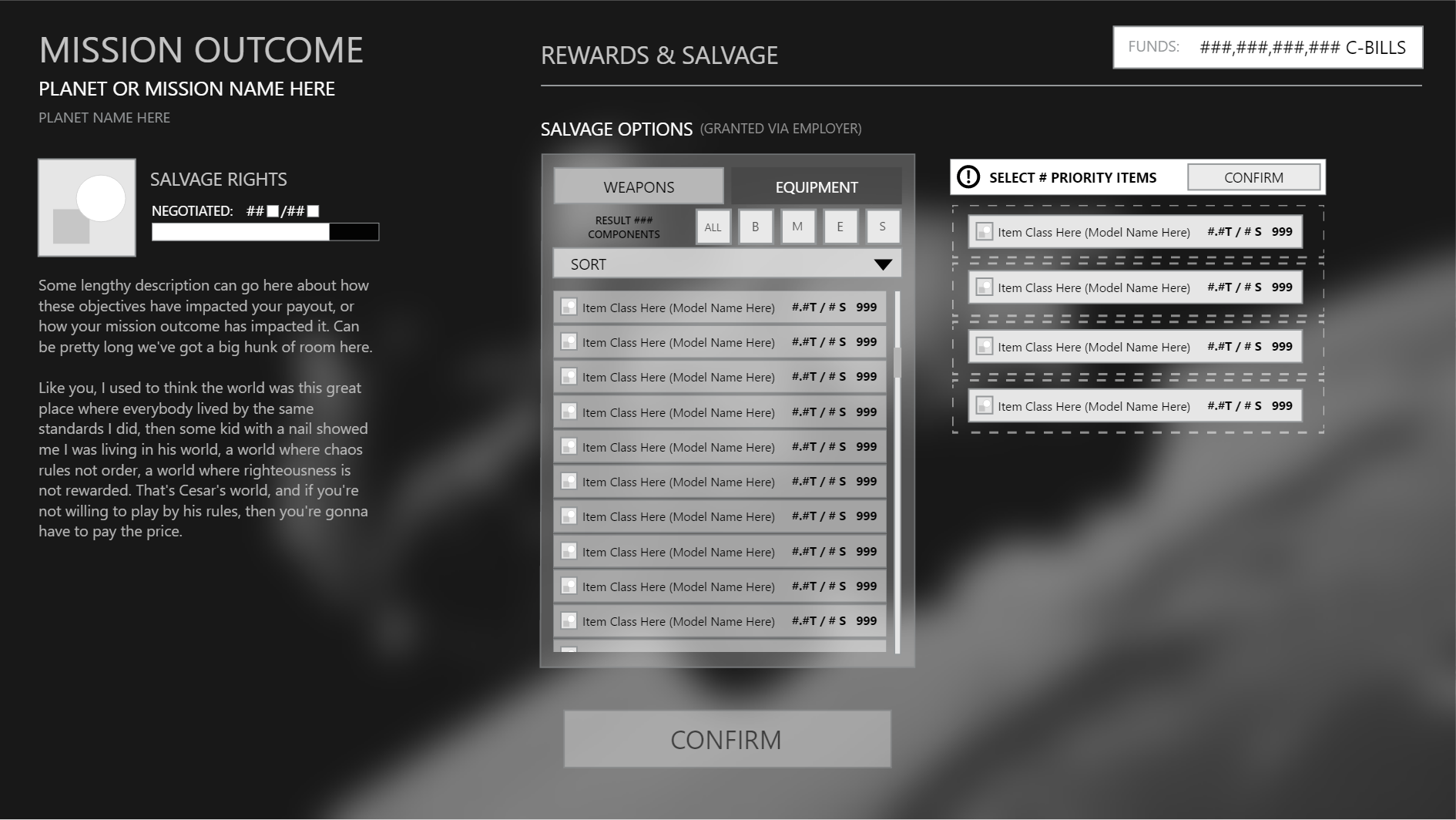
After-mission results
High Fidelity Concepts
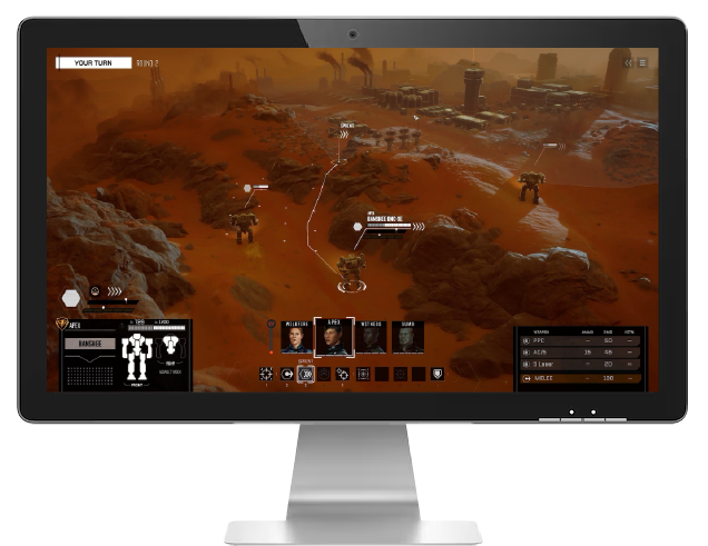
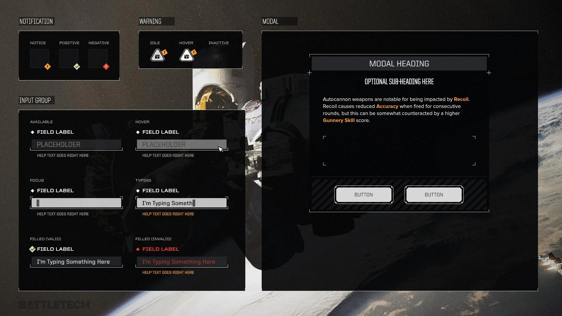
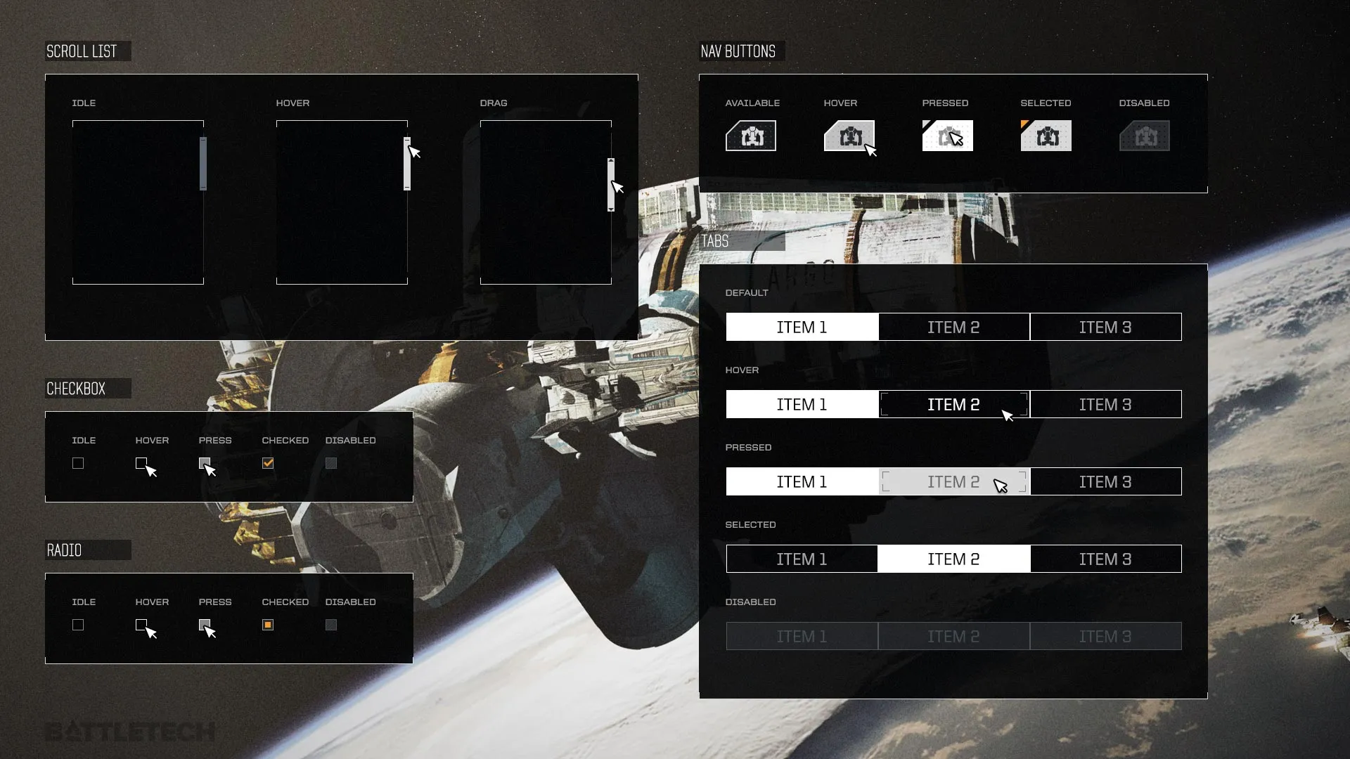
Using slim lines and a minimal color palette to maintain simplicity within the complexity, I created these concepts to implement and test with in Unity.


Iconography
These are just a handful of icons I made for identifying mechs, as well as actions the player can use, and status symbols.


UI/UX Design
•
Web Design
•
Mobile App Design
•
Illustration
•
UI/UX Design • Web Design • Mobile App Design • Illustration •
FIRST OBJECTIVE
Create an English LP to improve product image for a western audience, in order to expand the success of the app
PROBLEM
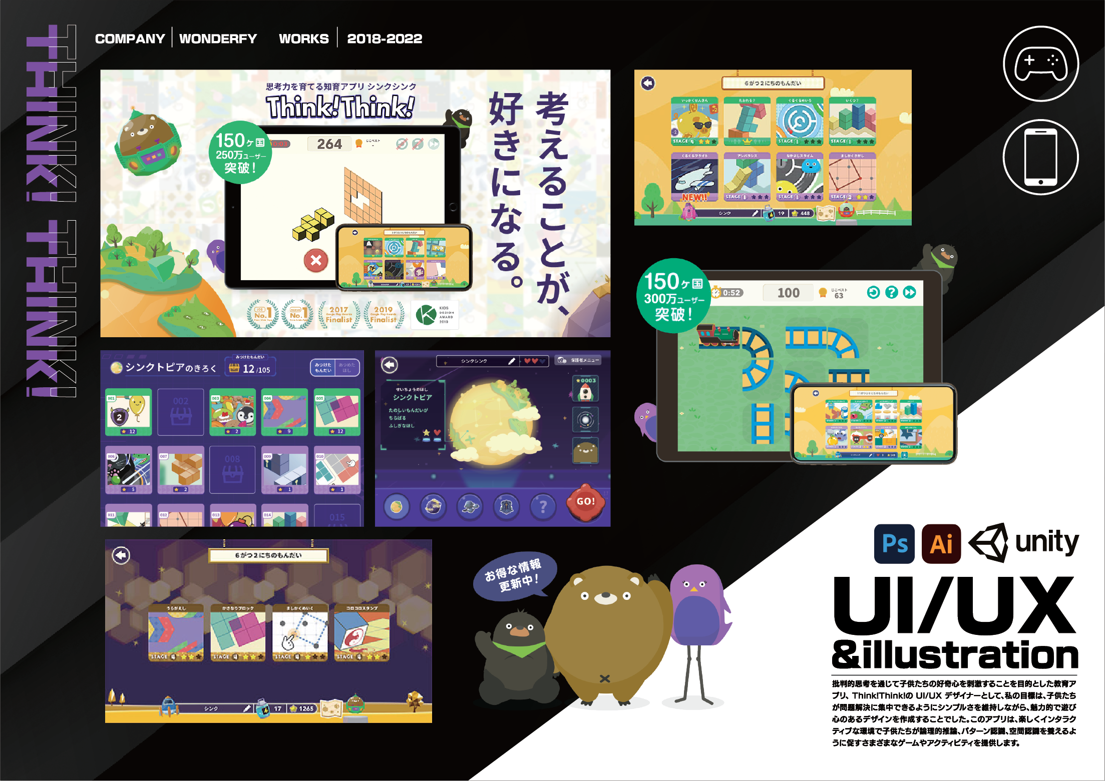
The previous website design was limited in its ability to engage viewers and showcase the full scope of Wonderfy’s product, Think!Think!
Wonderfy had recently rebranded and decided to put Think!Think! as the flagship product of the company. This required a whole new look with an in-depth tour of all of the product’s selling points.
SOLUTION
The redesigned homepage incorporates various improvements:
01. MOBILE RESPONSIVE DESIGN
02. A FOCUSED MESSAGE
03. A FRESH LOOK
Before
Ensuring Seamless User Experience Across All Devices
The website was redesigned to be fully responsive, adapting seamlessly to various screen sizes, including smartphones and tablets. This ensures an optimal user experience for all users, regardless of their device, and encourages easy browsing on the go.
Putting The Product On A Pedestal To Show Off In Detail
The homepage now focuses strongly on one, clear message: this great product that we are trying to spread to the rest of the world. I created new sections that explain why we made this app for the viewers to understand with clarity how using our product could benefit their child.
A New Brand Deserves A New Coat Of Paint Going Forward
With the rebranding of the company name I decided to pick a brand new color scheme for the website with new typography that reflected the fun, and enticing experience the app provides to its users.
What We Found.
The newly designed landing page caused traffic from the website to the app store to increase exponentially, leading to a 12% spike in monthly downloads after just 3 months.
RESULTS
After


